
Website Design · · 4 min read
10 Hero Section Examples (and What Makes Each One Work)
The hero is the first thing anyone sees on your site. Here are ten hero sections I designed, what makes each one work, and the rules they all follow.
By Florent, Oversight
The hero section is the top of your homepage: usually a headline, a line of supporting text, a call to action and a visual. Visitors decide in a few seconds whether to keep scrolling, so it's the most important part of any site to get right.
Below are ten hero sections I designed. Each one takes a different approach, and each has one idea doing the heavy lifting. After the examples there's a short list of the rules they all follow.
1. Transmission: a message made of signal
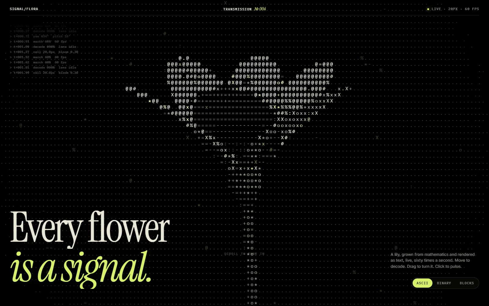
A heart built from glowing characters sits on black, under the headline "Every flower is a signal." The dark background makes the one bright shape impossible to miss.
Why it works: high contrast and a single focal point. Nothing competes with the visual or the headline. See Transmission.
2. Condensation: a headline behind glass
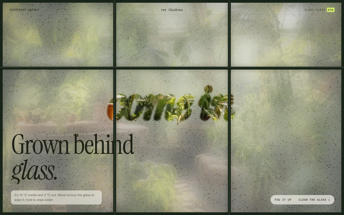
The page looks like a fogged-up window, with the headline "Grown behind glass." The texture is the whole idea.
Why it works: the visual and the words say the same thing. When the image is the message, the headline can stay short. See Condensation.
3. Signal & Soil: an image built from dots
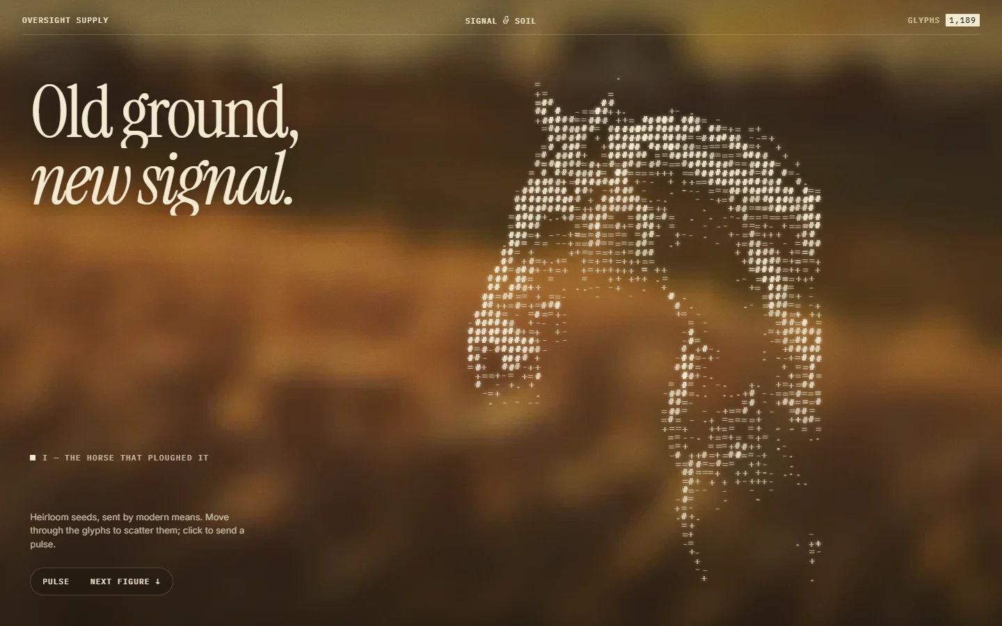
A horse made of small dots stands over a warm, blurred landscape: "Old ground, new signal."
Why it works: it mixes something natural with something digital, which is a quick way to say "traditional, but modern". See Signal & Soil.
4. Phototropism: everything leans in
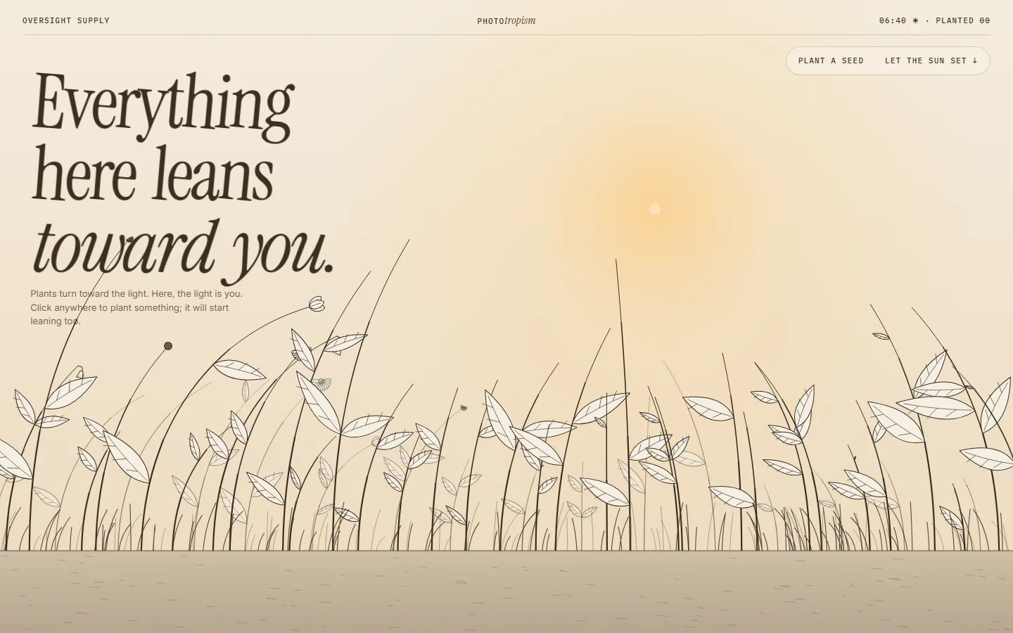
Line-drawn plants lean toward a soft sun, with "Everything here leans toward you."
Why it works: the drawing physically points at the visitor, which makes a warm, welcoming opening. Lots of empty space keeps it calm. See Phototropism.
5. Cyanotype: printed by the sun
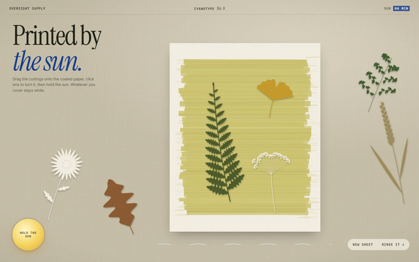
Pressed leaves and flowers arranged on a print, with "Printed by the sun." and a serif headline with an italic accent.
Why it works: the mix of upright and italic type in one headline creates emphasis without needing bold or colour. See Cyanotype.
6. Herbarium: a collection on the table
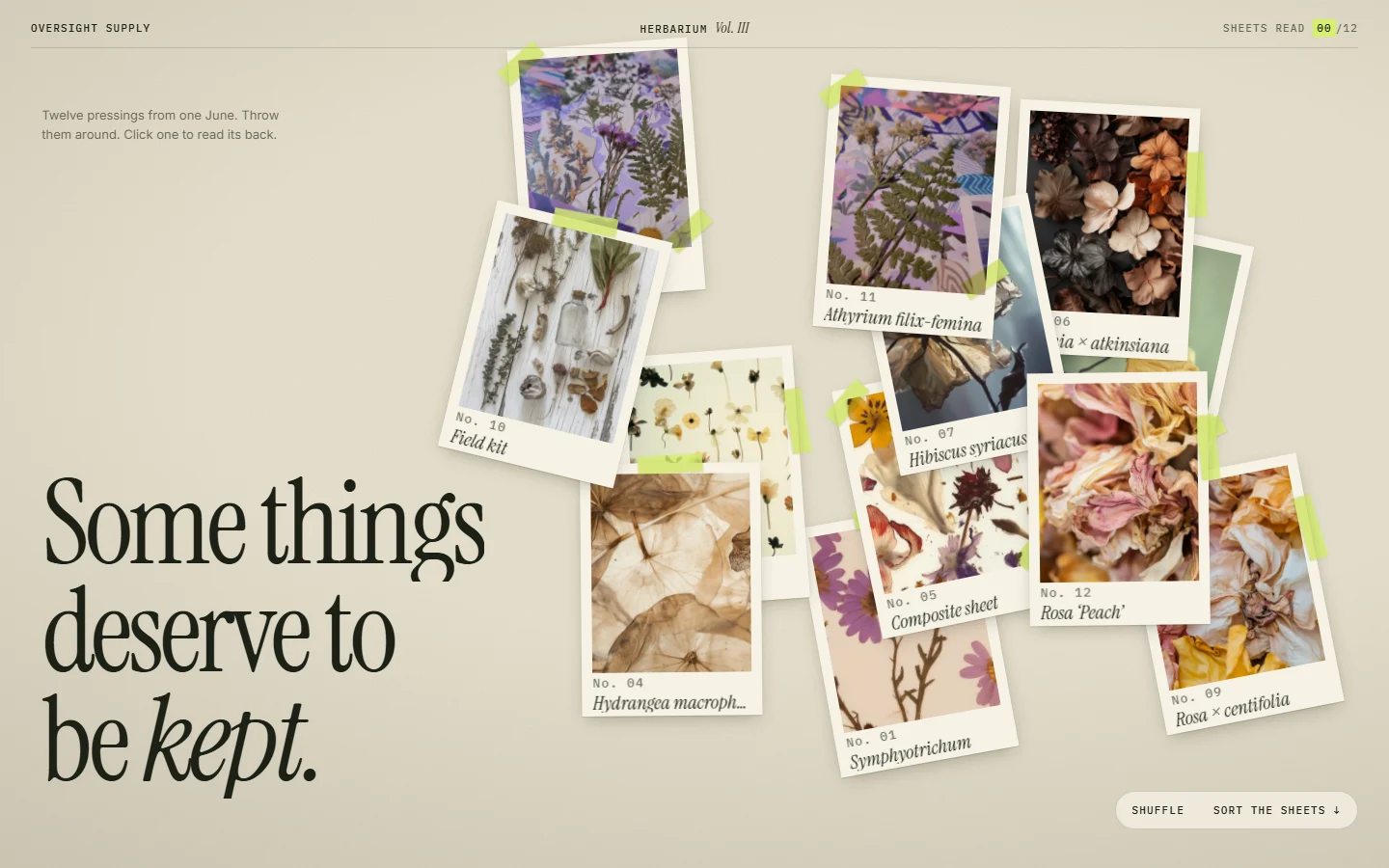
Photo cards of pressed plants are pinned around a large headline: "Some things deserve to be kept."
Why it works: the scattered cards feel collected by hand, perfect for archives, portfolios or anything personal. See Herbarium.
7. Joiner: one image from many
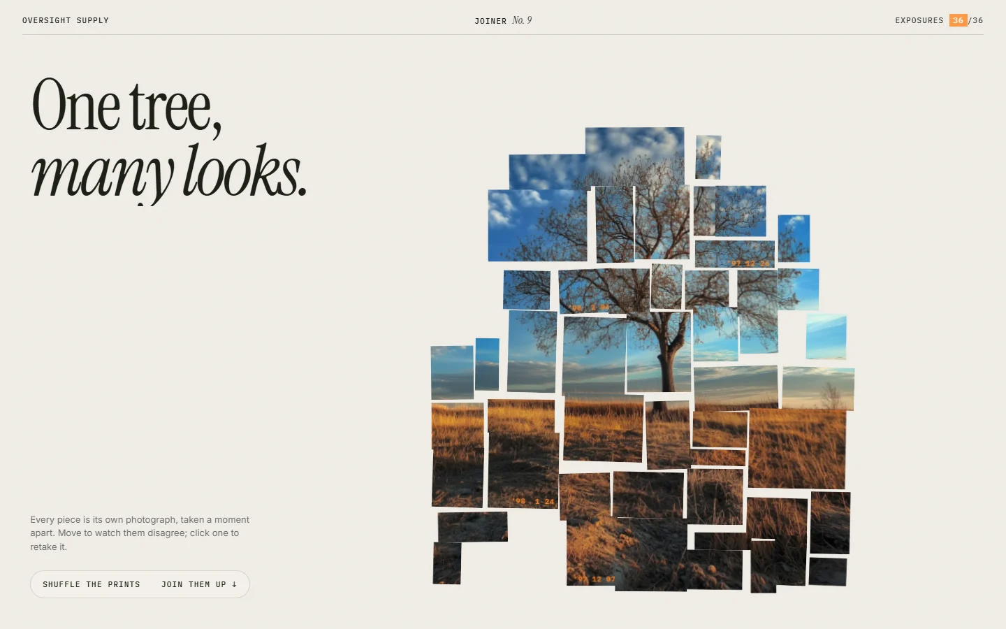
A tree assembled from many overlapping photo fragments: "One tree, many looks."
Why it works: it shows range (many looks) while still reading as one picture, a neat idea for photographers or studios. See Joiner.
8. Pigment: big type, soft texture
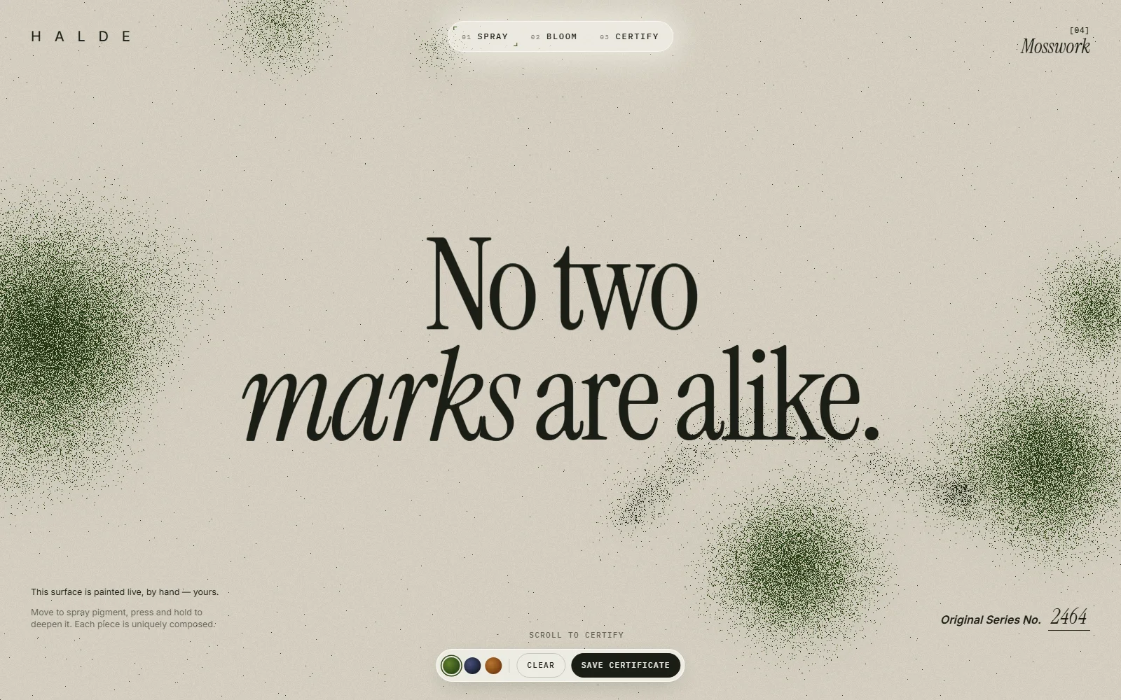
A large serif headline, "No two marks are alike," with soft paint marks drifting around it.
Why it works: when the headline is strong enough, it can be the visual. Big type plus gentle texture is hard to get wrong. See Pigment.
9. Rootsong: a glowing illustration in the dark
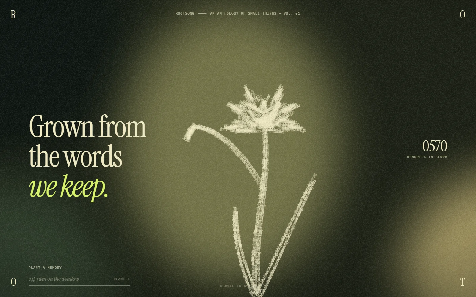
A glowing, hand-drawn flower on deep green: "Grown from the words we keep."
Why it works: a dark, moody background with one light element feels premium and quiet, and the accent colour on the last words guides the eye. See Rootsong.
10. Orbit: work in motion
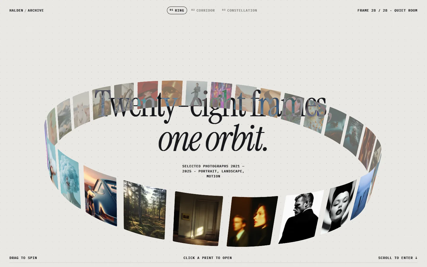
A ring of photo frames circles the headline "Twenty-eight frames, one orbit."
Why it works: it puts a whole body of work in view at once, without becoming a grid. Ideal for photographers and portfolios. See Orbit.
The rules every good hero follows
Look across all ten and the same patterns show up:
- One idea. One visual, one message. If you need two sentences to explain the hero, it's doing too much.
- A short headline. Most of these are under seven words.
- Hierarchy you can see from across the room. The headline is far bigger than everything else.
- The visual supports the words. Condensation is about glass, so the hero is glass.
- Space. Every example leaves plenty of empty room. Crowded heroes feel cheap.
- A clear next step. A button or a scroll cue, so the visitor knows what to do.
How to use these
Every hero above is a ready-made section on Oversight Supply. Open one, preview it live, and copy it as a single prompt for Claude, Cursor or v0 to rebuild it in your own project with your own words. Nine of these ten are free to copy; Orbit is a Pro section.